Home All Projects
All Projects All Projects All Projects
Tools Services About Contact

Precisery - Mobile App Case Study

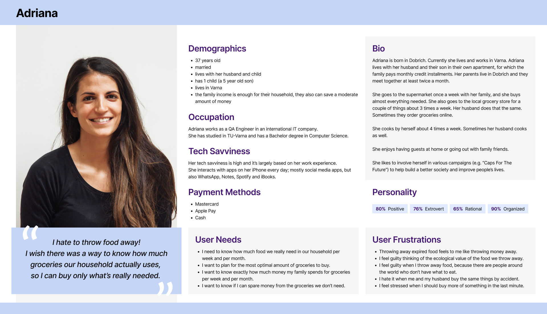
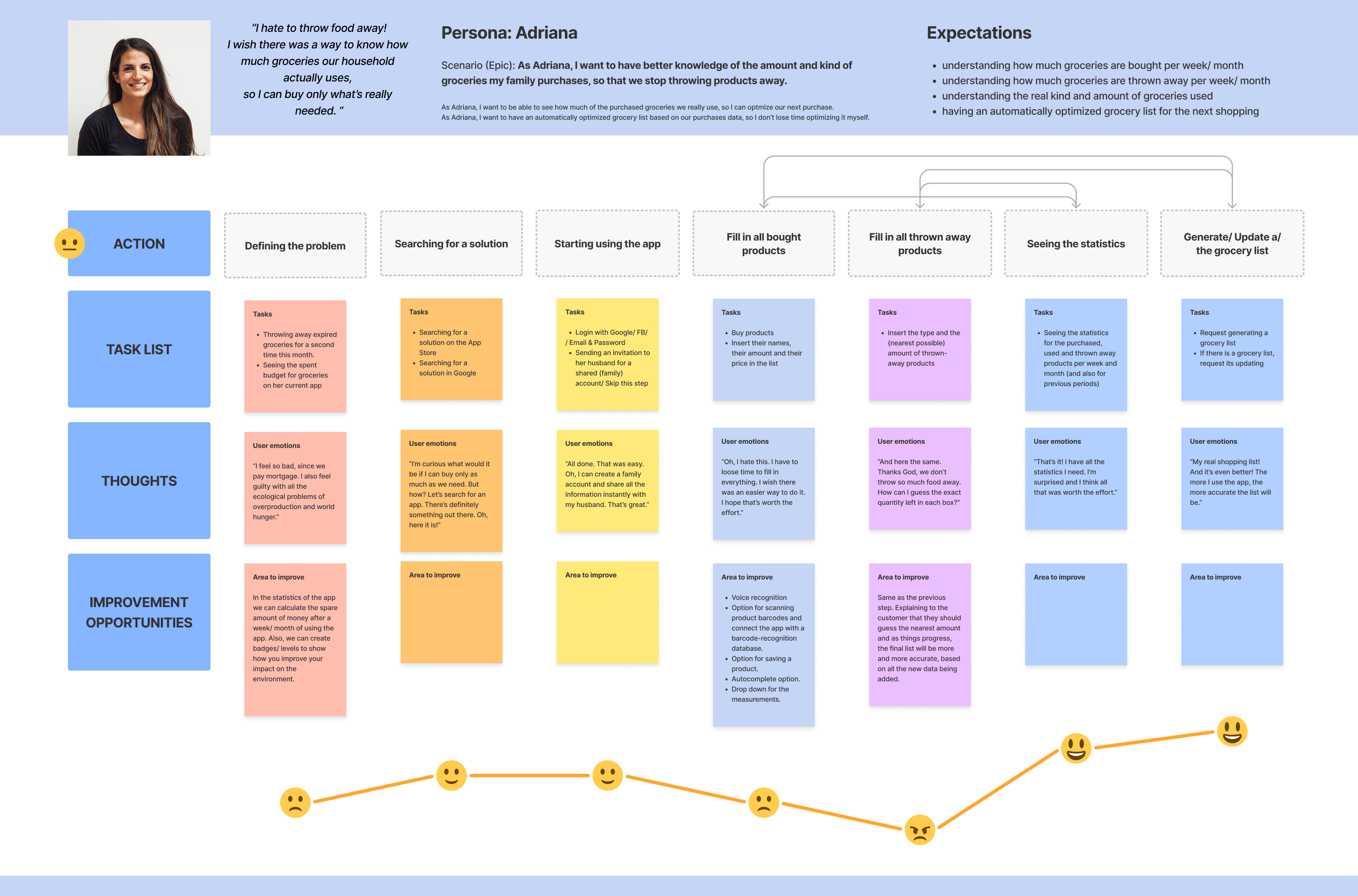
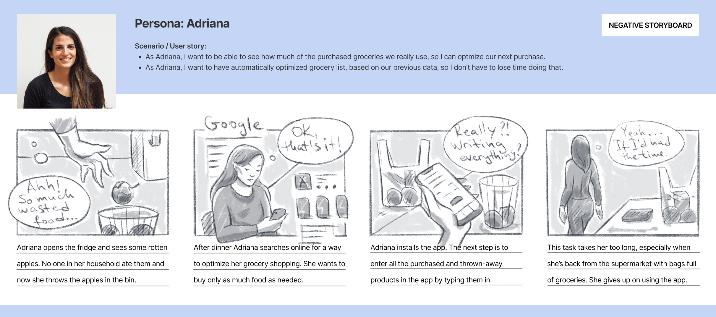
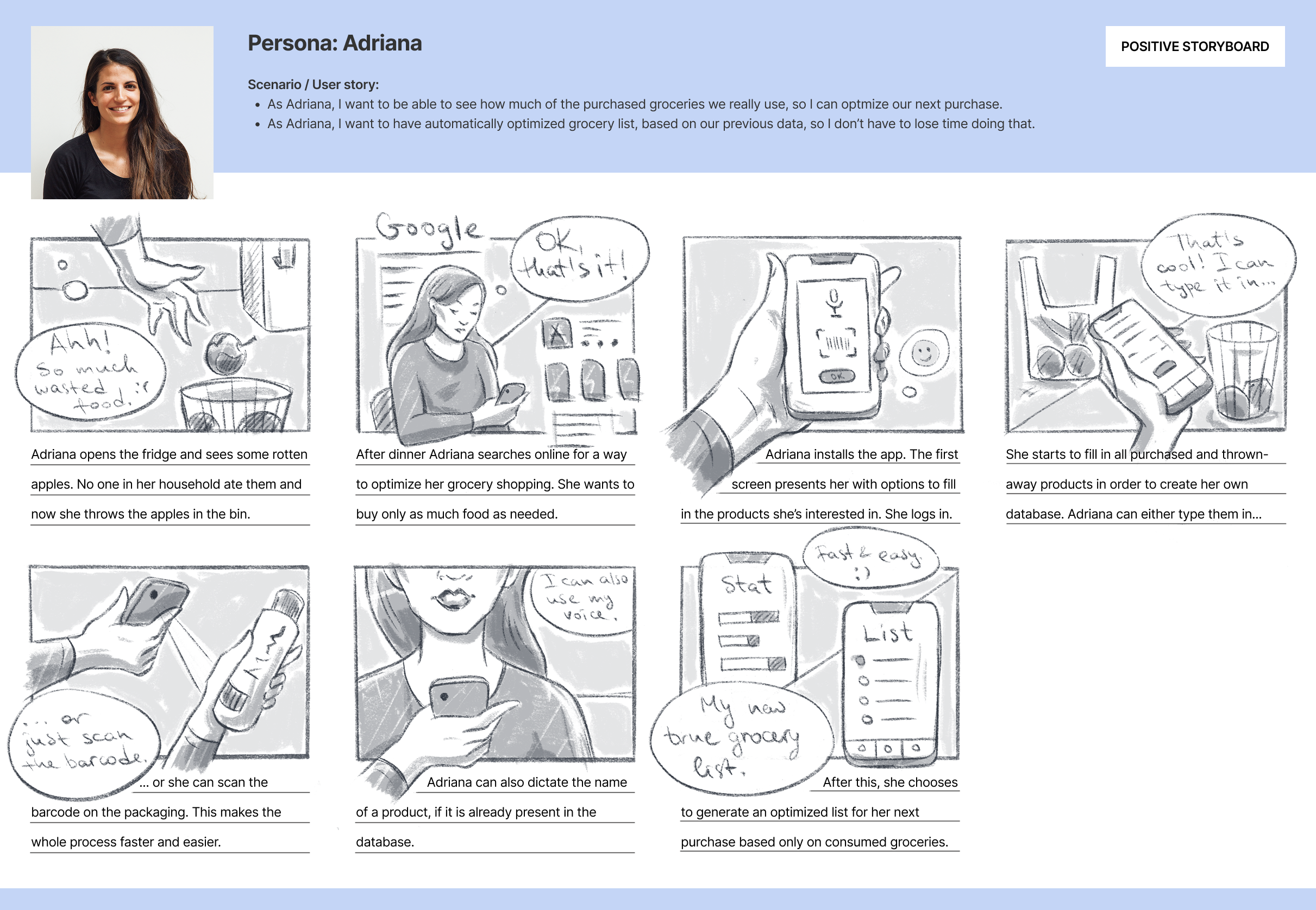
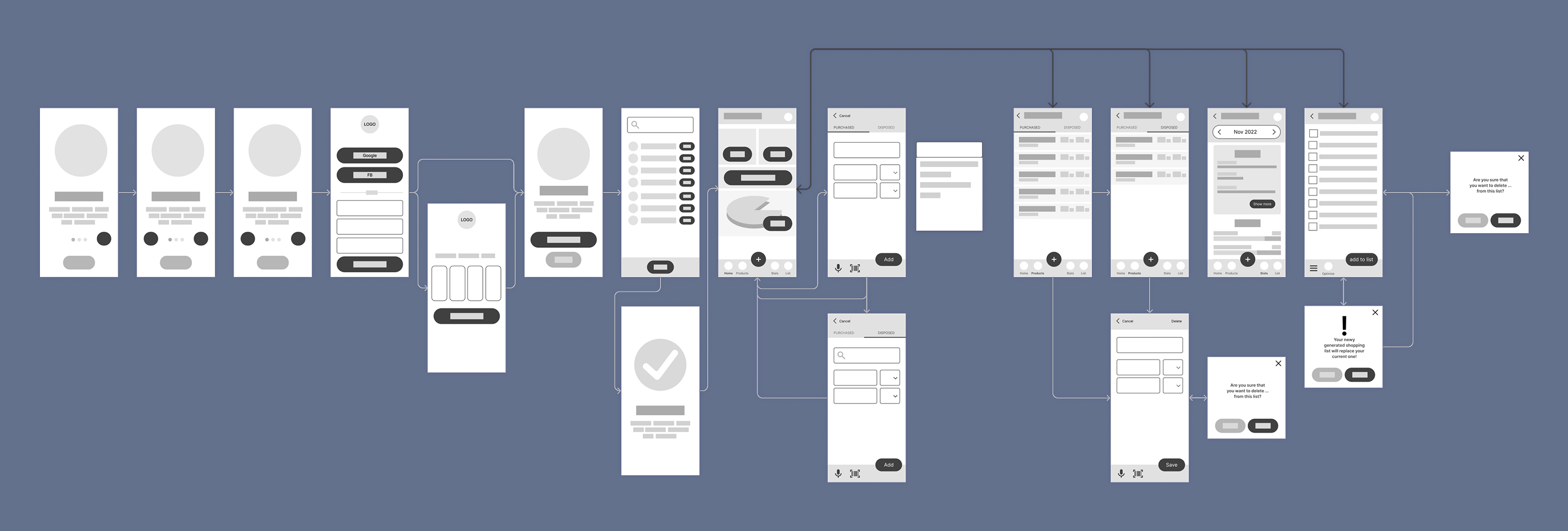
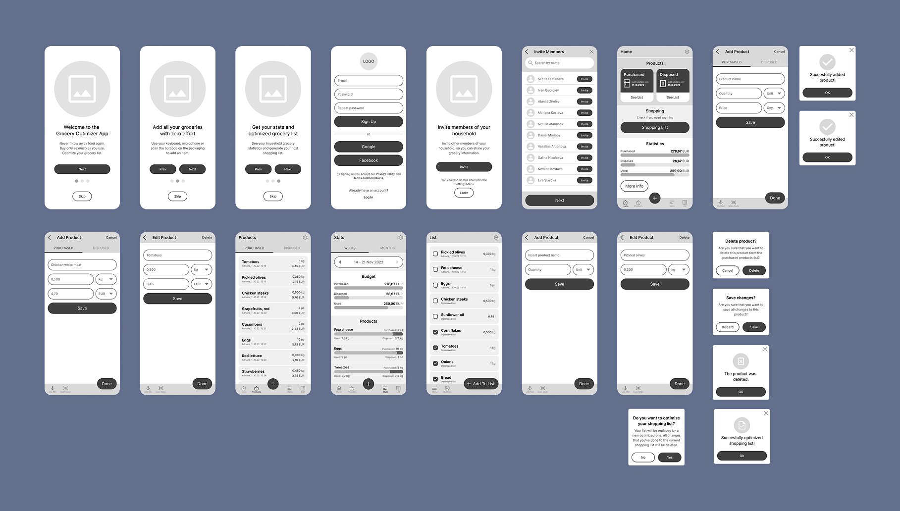
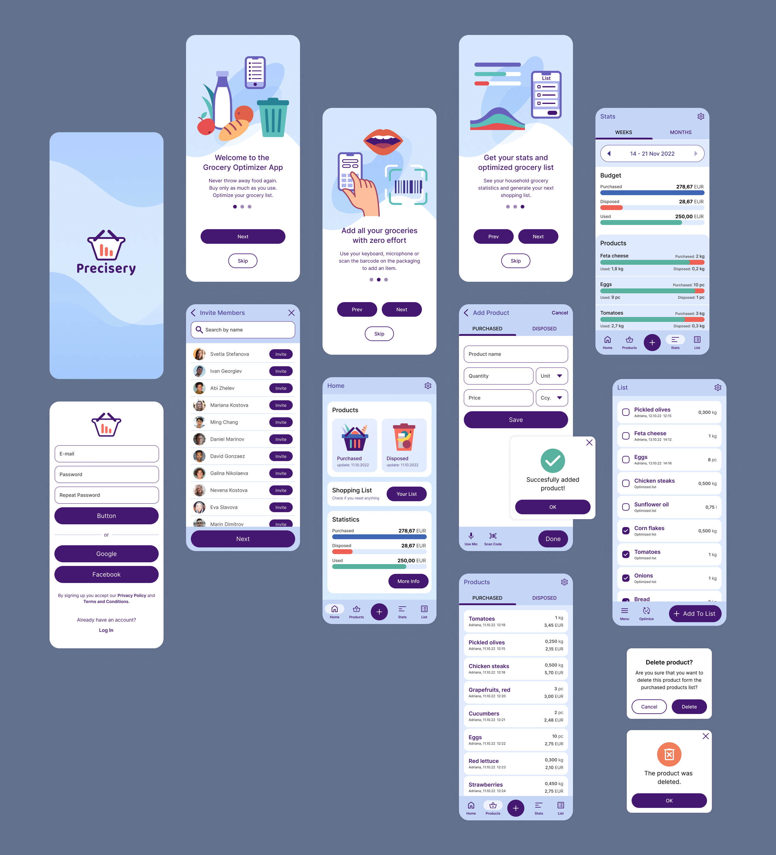
Defining the problem

"People spend hundreds of dollars on groceries every month, but don’t have a great understanding of how much they’re actually consuming and in what quantities."

As part of a UI/UX design course, I chose this problem from an existing list of challenges, recognizing its real-world impact and the opportunity to gather insights directly from users.

Knowing the users

I needed to define the type of people who would benefit the most from a solution to this problem. While I had some ideas about the format of the solution and what might motivate users, I wanted to avoid bias.

To gather real insights, I conducted a primary quantitative poll, ending with open-ended questions to collect more detailed responses. Using the poll results and demographic data, I started shaping user personas.

One of these personas is Adriana, our main user. She represents people who have trouble tracking their grocery consumption. Her habits and challenges will guide the design process and ensure the solution meets real user needs.

Building user stories

Based on our persona, the next step was to create epics that would help clarify the main user goals and motivations. I then broke these epics into more detailed user stories. Here’s the first one:

Epic:
As Adriana, I want to have a better knowledge of the amount and the type of groceries my family uses, so that we stop throwing products away.

Stories:
As Adriana, I want to have a list of the groceries we buy every week and month, so I know what and how much we buy for these periods.
As Adriana, I want to have a way to track the groceries we throw away, so I can buy only as much as we need.
As Adriana, I want to be able to see how much of the purchased groceries we really use, so I can optimize our next purchase.
As Adriana, I want to have automatically optimized grocery list, based on our previous data, so I don’t have to lose time doing that.

The user journey

Next, I focused on empathizing with the user by outlining their journey and the emotions they experience throughout the entire process – starting from the initial problem to the solution, and the benefits they gain afterward. Below is a depiction of this journey.

This process helped me identify potential inconveniences in using the app and suggest improvements to avoid them.

Low-fidelity wireframes

Next, I created rough sketches of the app, focusing on the main functionalities based on the steps so far. After the paper sketches, I transitioned to building low-fidelity wireframes in Figma to refine the layout and structure, as shown on the right.

High-fidelity wireframes

Next, I refined the low-fidelity wireframes by adding more detail, like spacing, typography, and button styles, turning them into high-fidelity wireframes. While they’re not as polished as a final mockup, these wireframes offer a clearer view of the app’s structure and interactions.

Interactive prototype

The detailed high-fidelity wireframe serves as a solid foundation for testing the app with users. To enable this, I created an interactive prototype in Figma. You can view the prototype here:

Testing the prototype

For testing, I conducted a non-moderated test using Maze with 7 users. While the users felt comfortable completing the main tasks, I identified some usability issues, which were subsequently addressed and corrected.

The final mockups

The final graphic elements were polished, including the creation of a logo, illustrations, defining color schemes, and incorporating them into the design. The final mockups can be seen in the images below.

Thank you for your attention!